R Basics: Weather Data
This tutorial relies on data provided as supplementary material for the paper Slingsby et al. 2017. Intensifying postfire weather and biological invasion drive species loss in a Mediterranean-type biodiversity hotspot. PNAS. http://dx.doi.org/10.1073/pnas.1619014114. The data can be downloaded here. It’s a ~13MB .xlsx file.
The study presents the results of 44 years of observation of permanent vegetation plots in the Cape of Good Hope Section of Table Mountain National Park, South Africa. The plots are dubbed “The Taylor Plots” in honour of Hugh Taylor, who established them in 1966. We’ll describe the details of the data as we work through the different tutorials, but for this first one we will only use the rainfall and temperature data for the reserve.
First, a few R basics
R can do basic calculations
1 + 1
## [1] 2
But to do more complex calculations, its easier to work with objects, which you assign, e.g.
x <- 1
x
## [1] 1
You can assign objects from other objects - usualy once you’ve performed an operation on them
y <- x + 1
y
## [1] 2
You can perform operations with multiple objects
y + x
## [1] 3
Combine objects
z <- c(x, y)
z
## [1] 1 2
Or apply functions to objects
sum(z)
## [1] 3
You can also access elements within an object using indexing with square brackets
z[1] #the first element in vector z
## [1] 1
z[2] #the second element in vector z
## [1] 2
Or evaluate them using logical expressions
z == 1
## [1] TRUE FALSE
z < 1
## [1] FALSE FALSE
z > 1
## [1] FALSE TRUE
Note that you can reassign (or overwrite) objects, so you need to use unique object names if you want to keep them
x <- sum(z)
x
## [1] 3
R keeps these objects in memory
ls() #function to call the list of objects in memory - and "#" lets you put comments like this in your code...
## [1] "x" "y" "z"
This is useful, but if the objects are large, it will slow down the speed of calculations, so it is good practice to discard (large) objects once you’re done with them (or only read them in when you need to)
rm(x, y, z)
ls()
## character(0)
Now let’s explore real data!
Reading in data
First we’ll call the packages/libraries that contain the functions we need
library(tidyverse)
## ── Attaching packages ─────────────────────────────────────── tidyverse 1.3.1 ──
## ✓ ggplot2 3.3.3     ✓ purrr   0.3.4
## ✓ tibble  3.1.0     ✓ dplyr   1.0.5
## ✓ tidyr   1.1.3     ✓ stringr 1.4.0
## ✓ readr   1.4.0     ✓ forcats 0.5.1
## ── Conflicts ────────────────────────────────────────── tidyverse_conflicts() ──
## x dplyr::filter() masks stats::filter()
## x dplyr::lag()    masks stats::lag()
library(readxl)
Now we need some data.
When reading data from a file into R you need to know the system path to the file on your computer, e.g. "/home/jasper/GIT/academic-kickstart/static/datasets".
Typing the whole thing out (or even copying and pasting) can get tedious, so its often better to set your working directory so R knows where to look for files, like so.
setwd("/home/jasper/GIT/academic-kickstart/static/datasets")
If you are trying to run this code on your own, you’ll get an error when trying to set your working directory to a folder on my computer :) - You need to change the line of code above to the folder where you put the data. If you’re on Windows, you’ll need to specify the route drive, e.g. C:. You also need to make sure to use single forwardslashes / or double backslashes \\, rather than the single backslash \ that is the default on Windows.
So my file path on windows would look like:
"C:/jasper/GIT/academic-kickstart/static/datasets"
or
"C:\\jasper\\GIT\\academic-kickstart\\static\\datasets"
Or on Mac it would be:
"/Users/jasper/GIT/academic-kickstart/static/datasets"
Lastly, if you’ve tried all that and it’s still not working try adding (or removing) slash(es) at the end.
We can check if we got it right using
getwd()
## [1] "/home/jasper/GIT/academic-kickstart/static/datasets"
Ok, once all that’s done, we can use R to have a look at what files are in that directory
list.files()
## [1] "pnas.1619014114.sd01.xlsx" "SAEON_field instrument list.xlsx"
And in this case we want to read data from pnas.1619014114.sd01.xlsx, but given that this is an excel workbook, it may have multiple separate worksheets of data. Let’s have a quick glimpse the lazy way
excel_sheets("pnas.1619014114.sd01.xlsx")
##  [1] "METADATA"           "weather"            "fires"
##  [4] "postfireweather"    "enviroment"         "excluded_spp"
##  [7] "veg1966"            "veg1996"            "veg2010"
## [10] "traits"             "speciesclimatedata"
There are 11 different sheets. Let’s start with the weather
weather <- read_excel("pnas.1619014114.sd01.xlsx", sheet = "weather")
## New names:
## * `` -> ...1
#Let's have a look at the first few lines?
head(weather) #
## # A tibble: 6 x 6
##    ...1 Date                 Temp  Rain Month  Year
##   <dbl> <dttm>              <dbl> <dbl> <dbl> <dbl>
## 1     1 1961-01-02 00:00:00  21     0       1  1961
## 2     2 1961-01-03 00:00:00  20.6   0       1  1961
## 3     3 1961-01-04 00:00:00  15     3.5     1  1961
## 4     4 1961-01-05 00:00:00  21     0       1  1961
## 5     5 1961-01-06 00:00:00  19.8   0.8     1  1961
## 6     6 1961-01-07 00:00:00  22     0       1  1961
or last few lines
tail(weather)
## # A tibble: 6 x 6
##    ...1 Date                 Temp  Rain Month  Year
##   <dbl> <dttm>              <dbl> <dbl> <dbl> <dbl>
## 1 17474 2009-11-25 00:00:00  15       0    11  2009
## 2 17475 2009-11-26 00:00:00  18.9     0    11  2009
## 3 17476 2009-11-27 00:00:00  16.9     0    11  2009
## 4 17477 2009-11-28 00:00:00  22.2     0    11  2009
## 5 17478 2009-11-29 00:00:00  19.2     0    11  2009
## 6 17479 2009-11-30 00:00:00  17.3     0    11  2009
There are 17476 rows of data, so it’s a bit tricky to inspect it all! Fortunately we can call a summary like so
summary(weather)
##       ...1            Date                          Temp
##  Min.   :    1   Min.   :1961-01-02 00:00:00   Min.   : 6.30
##  1st Qu.: 4371   1st Qu.:1973-12-19 18:00:00   1st Qu.:15.00
##  Median : 8740   Median :1985-12-09 12:00:00   Median :17.50
##  Mean   : 8740   Mean   :1985-12-05 08:31:36   Mean   :17.62
##  3rd Qu.:13109   3rd Qu.:1997-12-07 06:00:00   3rd Qu.:20.00
##  Max.   :17479   Max.   :2009-11-30 00:00:00   Max.   :35.30
##       Rain             Month             Year
##  Min.   : 0.0000   Min.   : 1.000   Min.   :1961
##  1st Qu.: 0.0000   1st Qu.: 4.000   1st Qu.:1973
##  Median : 0.0000   Median : 7.000   Median :1985
##  Mean   : 0.9914   Mean   : 6.514   Mean   :1985
##  3rd Qu.: 0.2000   3rd Qu.:10.000   3rd Qu.:1997
##  Max.   :97.0000   Max.   :12.000   Max.   :2009
Nice, but this doesn’t help see trends etc. It’s difficult to eyeball daily rainfall so let’s calculate the annual totals
Data wrangling
Here we use the group_by() and summarise() functions provided by library(dplyr) to calculate the annual rainfall totals using sum().
annualrain <- weather %>% group_by(Year) %>% summarise(Rainfall = sum(Rain))

head(annualrain) #to see what we get
## # A tibble: 6 x 2
##    Year Rainfall
##   <dbl>    <dbl>
## 1  1961     382
## 2  1963     304.
## 3  1964     418.
## 4  1965     403.
## 5  1966     389
## 6  1967     371.
If you were to translate this line of code into English it would say:
Take the
weatherdataframe, and for each Year, sum the total rainfall across all observation (months in this case).
library(dplyr) and other tidyverse packages contain a series of functions that can be thought of as verbs, providing the grammar for you develop code statements, e.g.:
arrange()filter()mutate()slice()summarise()group_by()
(Pro tip: Do yourself a favour and apply the fourth law here!)
Binding the verbs together into code sentences is made possible by the pipe %>% function, which essentially allows you to pass the output of one function (or verb) to the next without making a new object in memory each time.
i.e. without %>% this code would have to be written
step1 <- group_by(weather, Year)
step2 <- summarise(step1, Rainfall = sum(Rain))
head(step2)
## # A tibble: 6 x 2
##    Year Rainfall
##   <dbl>    <dbl>
## 1  1961     382
## 2  1963     304.
## 3  1964     418.
## 4  1965     403.
## 5  1966     389
## 6  1967     371.
Which creates the unwanted objects like step1, which just waste memory, so let’s get rid of them
rm(step1, step2)
So looking at annual totals is easier to interpret than daily data, but not as good as a graph…
Plotting data with library(ggplot2)
To plot the data using the functions in library(ggplot2) we first describe the data, telling ggplot what data object we want to use and which variables should be our x and y axes, like so.
r <- ggplot(annualrain, aes(x = Year, y = Rainfall))
Then we can play with different plot types
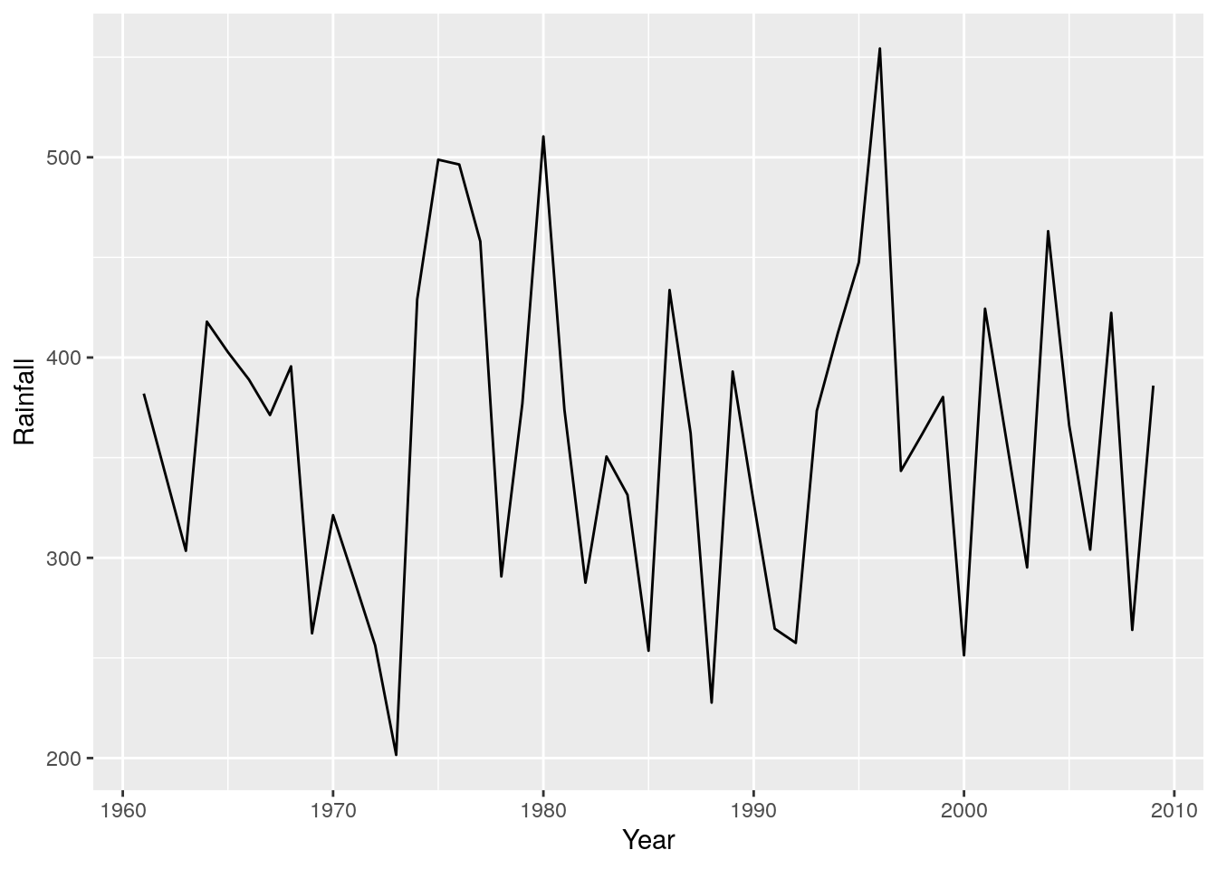
r + geom_line() #A line graph - as easy as that!!!
I find time-series are often easier to look at if you shade one side, like so
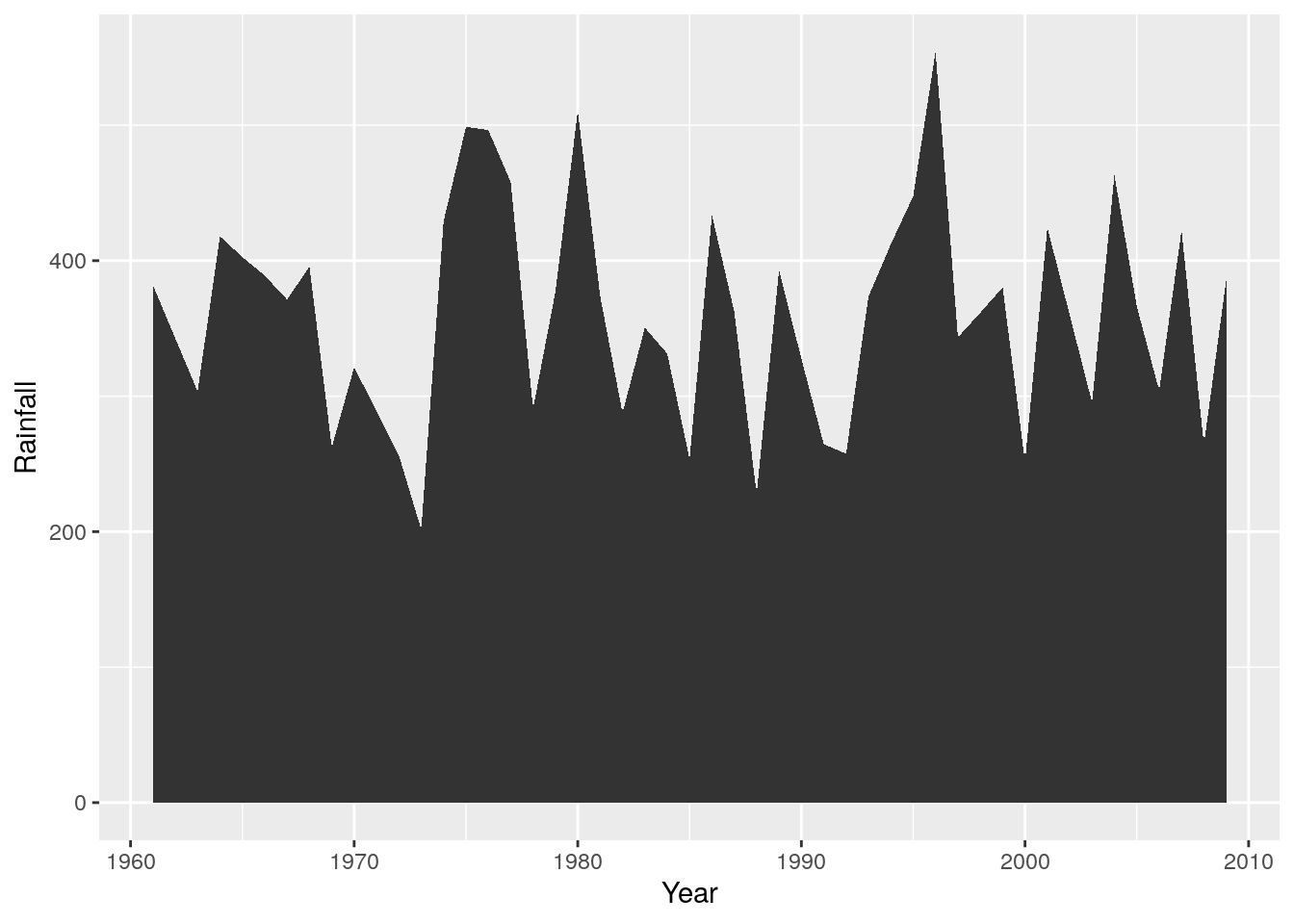
r + geom_area()
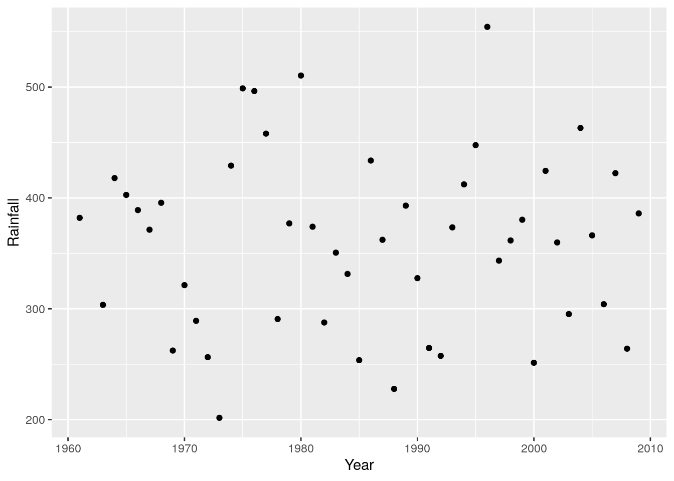
Which is obviously easier to interpret than a scatterplot of points
r + geom_point()
Unless you add a trend line, like a loess spline
r + geom_point() + geom_smooth(method = 'loess')
## `geom_smooth()` using formula 'y ~ x'
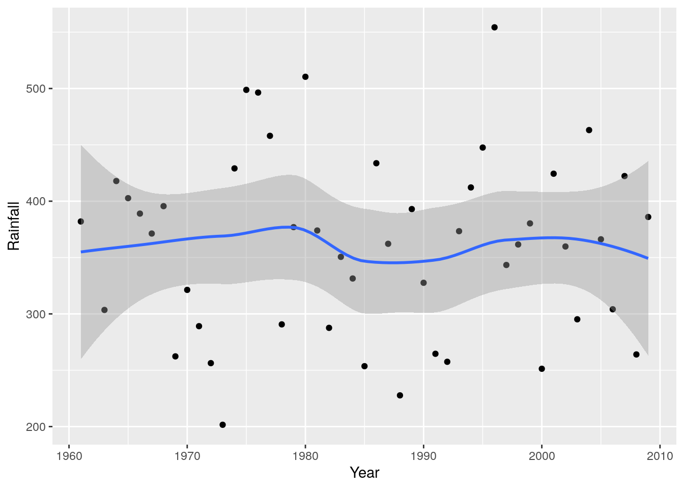
So there have been spells of wetter and dryer years, but no clear trend. What about if we wanted to see if there’ve been any changes in seasonality? I.e. particular months show patterns of getting wetter or dryer?
More data wrangling and plotting
To summarise the data by month is very easy, all we need do is add Month to the group_by() statement in the code we used to get the annual totals.
monthlyrain <- weather %>% group_by(Year, Month) %>% summarise(Rainfall = sum(Rain))
## `summarise()` has grouped output by 'Year'. You can override using the `.groups` argument.
head(monthlyrain)
## # A tibble: 6 x 3
## # Groups:   Year [1]
##    Year Month Rainfall
##   <dbl> <dbl>    <dbl>
## 1  1961     1     44.7
## 2  1961     2      5.7
## 3  1961     3     11.9
## 4  1961     4      9.4
## 5  1961     5     45.2
## 6  1961     6     86.4
The only issue now is that it is difficult to interpret the table directly, and we have 3 variables, so it’s not as simple to plot.
Fortunately, library(ggplot2) has the functions facet_grid() and facet_wrap() that make it very easy to make multi-panel plots. Here we use the same code as the line plot above, but apply it to the object monthlyrain and add facet_grid() indicating that the rows of the mutiplot should be the months.
r <- ggplot(monthlyrain, aes(x = Year, y = Rainfall))
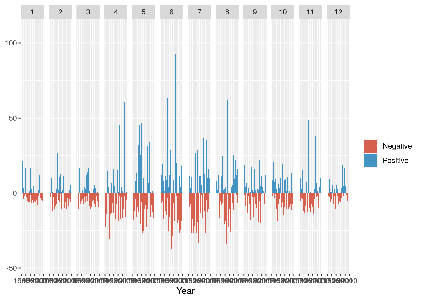
r + geom_line() + facet_grid(rows = vars(Month))
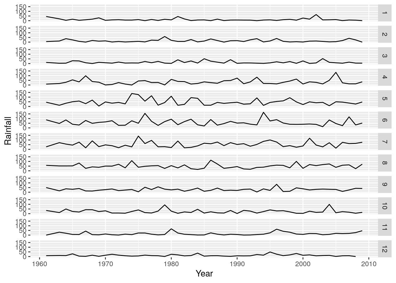
Nice! We can clearly see that months 4 to 8 (April to August) are the wetter months in this region, but its still difficult to tell which years were wetter or drier relative to the long term average. To do this we need to calculate the anomalies (i.e. the differences from the mean).
Getting the mean for each month is very easy to do by adapting our code above and applying it to the monthlyrain dataframe we have already calculated. We simply change the function passed to summarise() from sum() to mean(), and remove Year from the group_by() statement.
i.e we’re saying
Take the
monthlyraindataframe, and for each Month, calculate the average rainfall across all years.
like so
monthlymean <- monthlyrain %>% group_by(Month) %>% summarise(MeanMonthlyRainfall = mean(Rainfall))

head(monthlymean)
## # A tibble: 6 x 2
##   Month MeanMonthlyRainfall
##   <dbl>               <dbl>
## 1     1                11.4
## 2     2                13.7
## 3     3                13.4
## 4     4                32.6
## 5     5                47.6
## 6     6                58.7
Ok, but now we need to match the MeanMonthlyRainfall with each month in monthlyrain. This is very easy with the function merge().
monthlyrain <- merge(monthlyrain, monthlymean)

head(monthlyrain)
##   Month Year Rainfall MeanMonthlyRainfall
## 1     1 1961     44.7              11.425
## 2     1 1999      5.2              11.425
## 3     1 1989      6.4              11.425
## 4     1 1979     14.8              11.425
## 5     1 2006      0.7              11.425
## 6     1 1996      2.3              11.425
Ok, now we want to calculate the positive and negative differences from the mean. For plotting purposes we’ll do this as separate Positive and Negative columns. R makes this easy, by allowing simple mathematical operations and allowing us to access or assign new columns using the $ operator, like so.
monthlyrain$Positive <- monthlyrain$Rainfall - monthlyrain$MeanMonthlyRainfall

head(monthlyrain)
##   Month Year Rainfall MeanMonthlyRainfall Positive
## 1     1 1961     44.7              11.425   33.275
## 2     1 1999      5.2              11.425   -6.225
## 3     1 1989      6.4              11.425   -5.025
## 4     1 1979     14.8              11.425    3.375
## 5     1 2006      0.7              11.425  -10.725
## 6     1 1996      2.3              11.425   -9.125
Now we have negative values in our Positive column, but that’s ok, because we can set them to zero using a logical operator that detects negative values, like so:
monthlyrain$Positive[which(monthlyrain$Positive < 0)] <- 0

head(monthlyrain)
##   Month Year Rainfall MeanMonthlyRainfall Positive
## 1     1 1961     44.7              11.425   33.275
## 2     1 1999      5.2              11.425    0.000
## 3     1 1989      6.4              11.425    0.000
## 4     1 1979     14.8              11.425    3.375
## 5     1 2006      0.7              11.425    0.000
## 6     1 1996      2.3              11.425    0.000
Ok, there were a few steps that went into that. Let’s break it down:
- the logical expression
<returnsTRUEorFALSEfor whether the values inmonthlyrain$Positiveare less than zero or not; - the
which()function translates all the values that areTRUEto their position in the vector/columnmonthlyrain$Positive; - the square brackets (or indexing) allows us to call all those values in the vector/column
monthlyrain$Positive; and - assign them the value zero with
<- 0
Now we do the same for the Negative values:
monthlyrain$Negative <- monthlyrain$Rainfall - monthlyrain$MeanMonthlyRainfall
monthlyrain$Negative[which(monthlyrain$Negative > 0)] <- 0

head(monthlyrain)
##   Month Year Rainfall MeanMonthlyRainfall Positive Negative
## 1     1 1961     44.7              11.425   33.275    0.000
## 2     1 1999      5.2              11.425    0.000   -6.225
## 3     1 1989      6.4              11.425    0.000   -5.025
## 4     1 1979     14.8              11.425    3.375    0.000
## 5     1 2006      0.7              11.425    0.000  -10.725
## 6     1 1996      2.3              11.425    0.000   -9.125
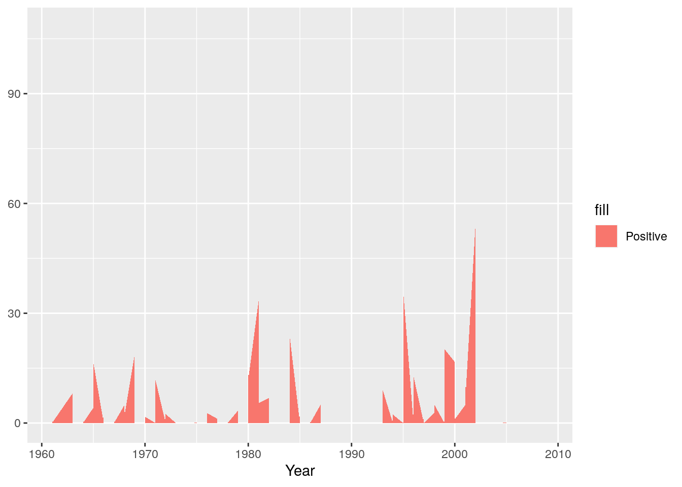
And we’re ready to start plotting. I’ll build this up piece by piece. First we’ll set up the plot and add the positive anomaly as a “ribbon” plot
g <- ggplot(monthlyrain, aes(x = Year))

g <- g + geom_ribbon(aes(ymin = 0, ymax = Positive, fill="Positive"))

g
Now we’ll add the negative anomaly ribbon
g <- g + geom_ribbon(aes(ymin = Negative, ymax = 0 ,fill="Negative"))

g
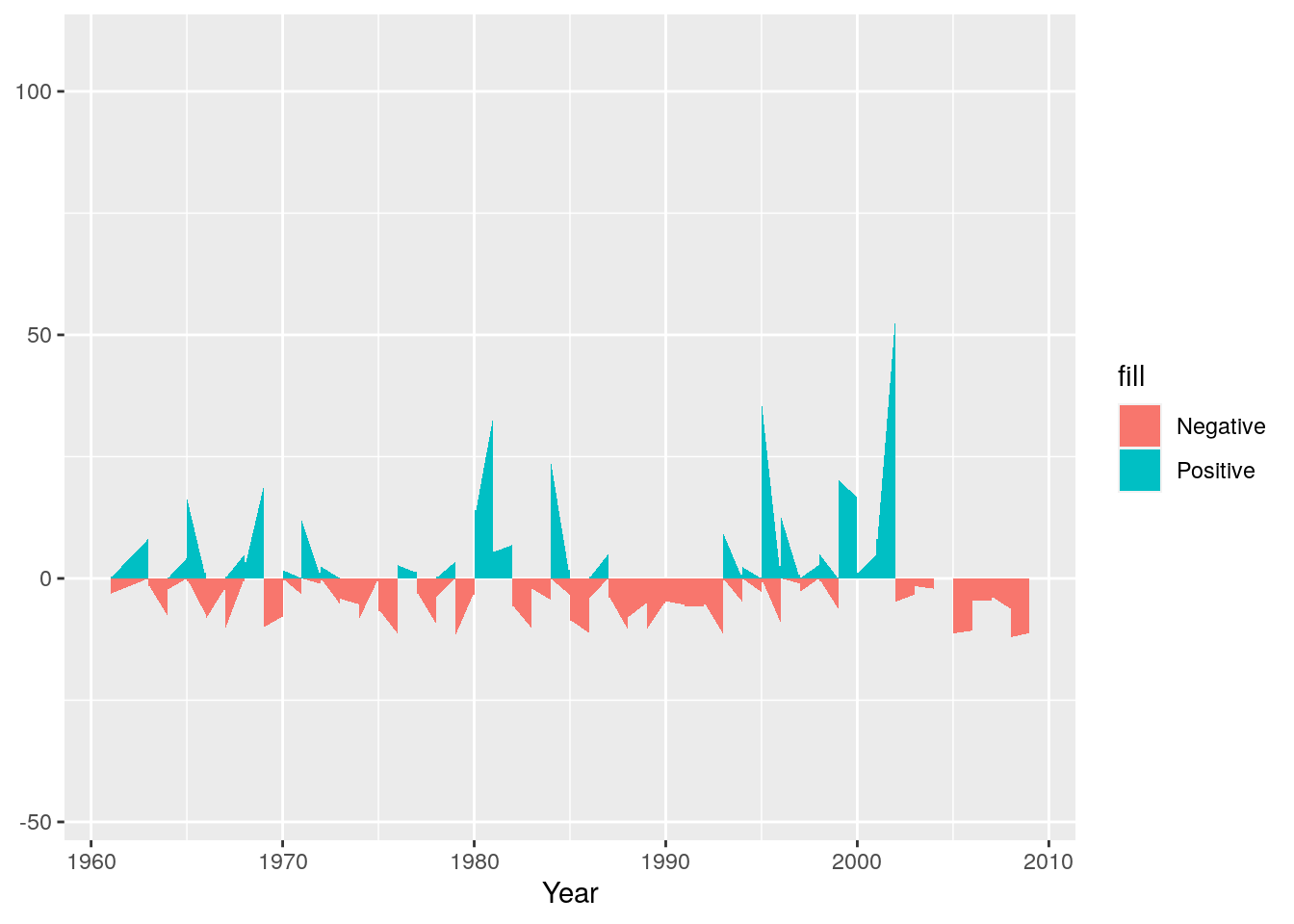
Next we can set colours to make sure they make sense - e.g. positive (wetter) anomalies should be blue and negative (drier) should be red.
g <- g + scale_fill_manual(name="",values=c("#D6604D", "#4393C3"))

g
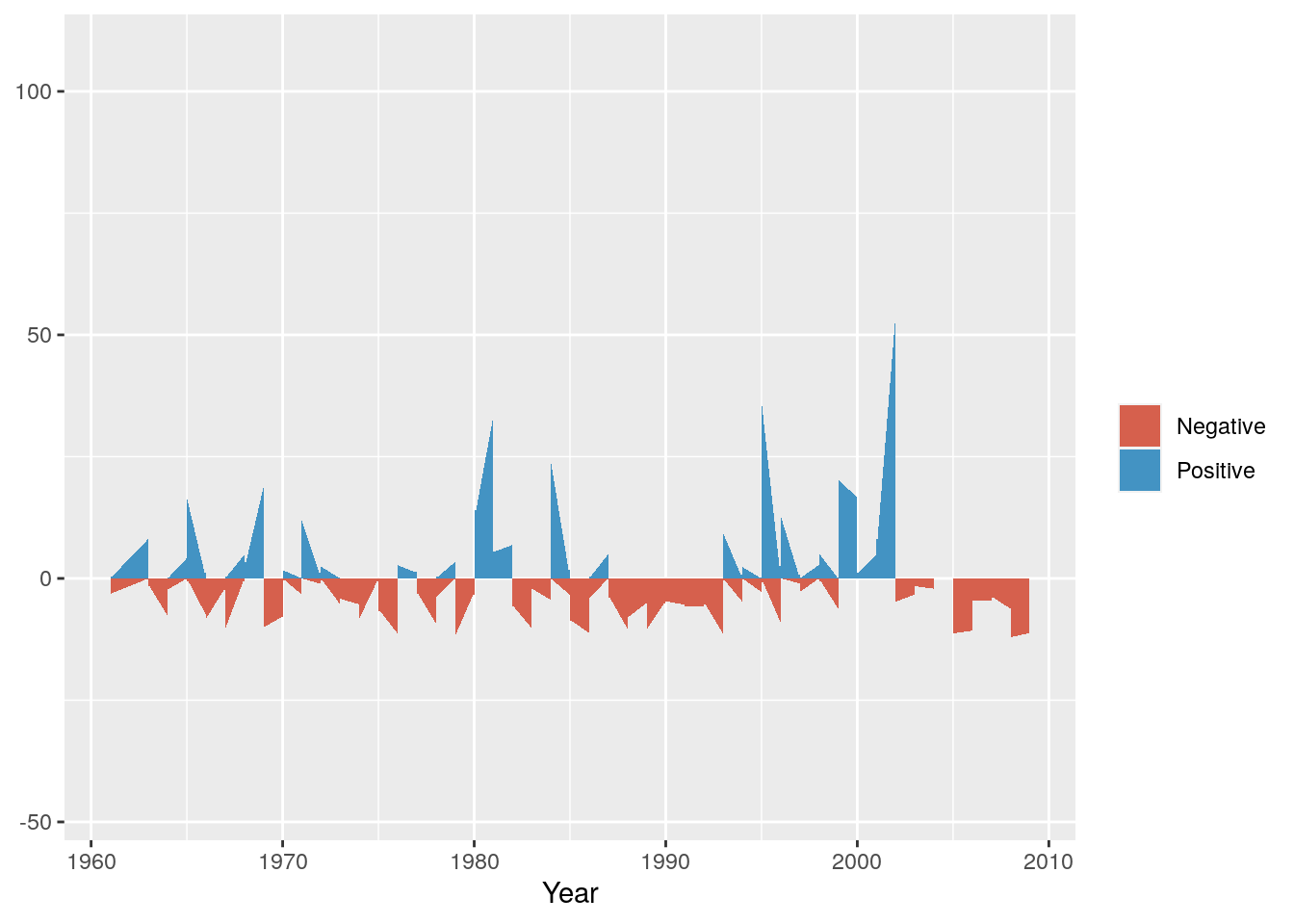
Now we can split it into a multipanel by month using facet_grid()
g <- g + facet_grid(cols = vars(Month))

g
And add a title, meaningful y-axis label and flip the axes so we can read the graph properly
g <- g + ggtitle("Monthly Rainfall Anomaly (1961-2010)") + coord_flip() + ylab("Rainfall (mm)")

g
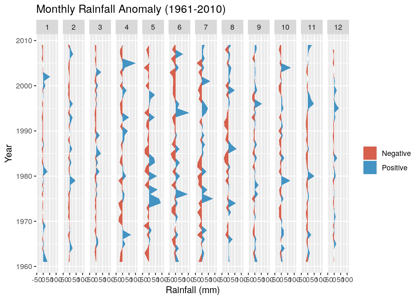
Not much to observe other than the positive anomalies are typically bigger than the negative anomalies. This is not surprising, because the negative anomalies are bounded by zero (i.e. no rain is the driest it can get), while there are no constraints on the positive anomaly. For example, the wettest day on record had 97 mm.
What about summer anomalies?
Now see if you can adapt the code above to develop the same figure using the Temp data in the object weather.
Note that you’ll need to calculate monthly means, not sum the totals, and better to swap the colours so red is the positive anomaly (hotter) and blue the negative (cooler).
It should look like this:
## `summarise()` has grouped output by 'Year'. You can override using the `.groups` argument.
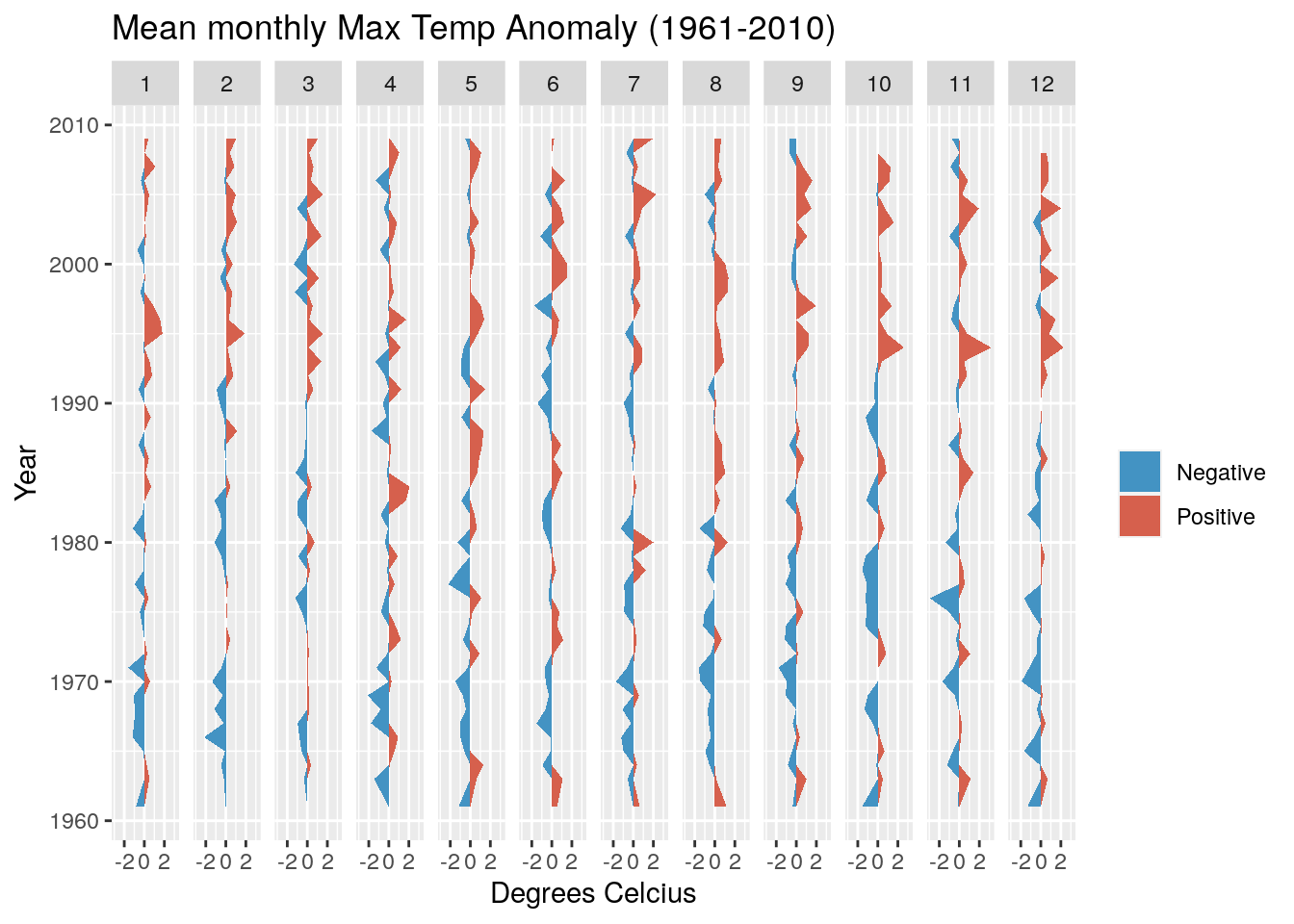
This looks a bit more interesting, with fewer cool anomalies and more hot anomalies as we head towards the present. It turns out the temperature has risen by ~1.2 degrees over the observation period.